Industrio
How we got started
Industrio is able to apply a very precise operating and consulting structure to a wide range of different contexts. This was translated into a coordinated image based on a hexagonal form, created by Plus Communications, which served as inspiration for our design for the website in the direction of a responsive ‘extreme’ design. Just as Industrio manages to ensure structure, clarity and organisation in achieving the ultimate goal of launching a new product, we felt that at the same time its website had to be maximised to adapt to the different contexts of use, maintaining characteristics of design and unique identity.
A clear identity, changeable forms, smart solutions
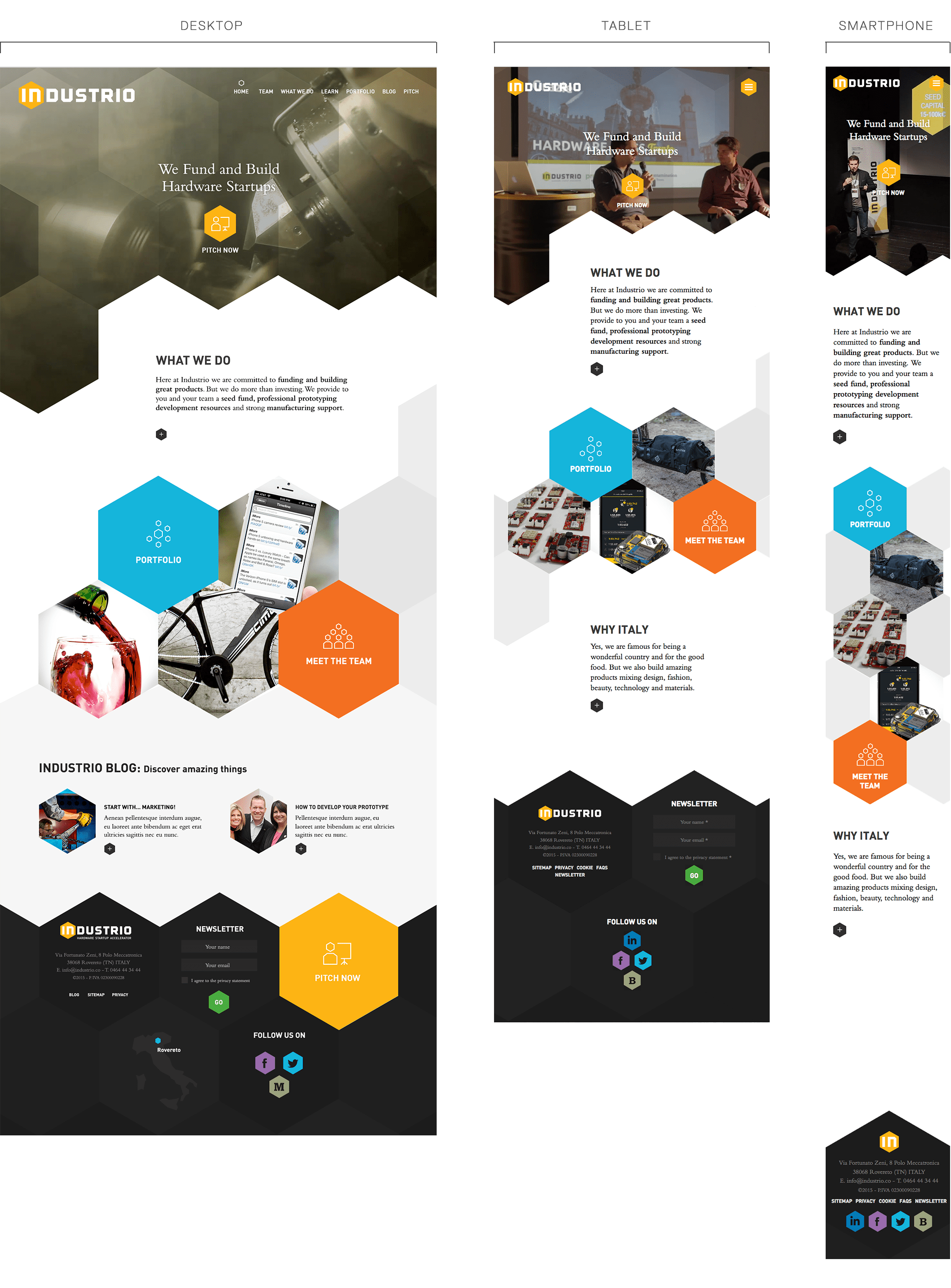
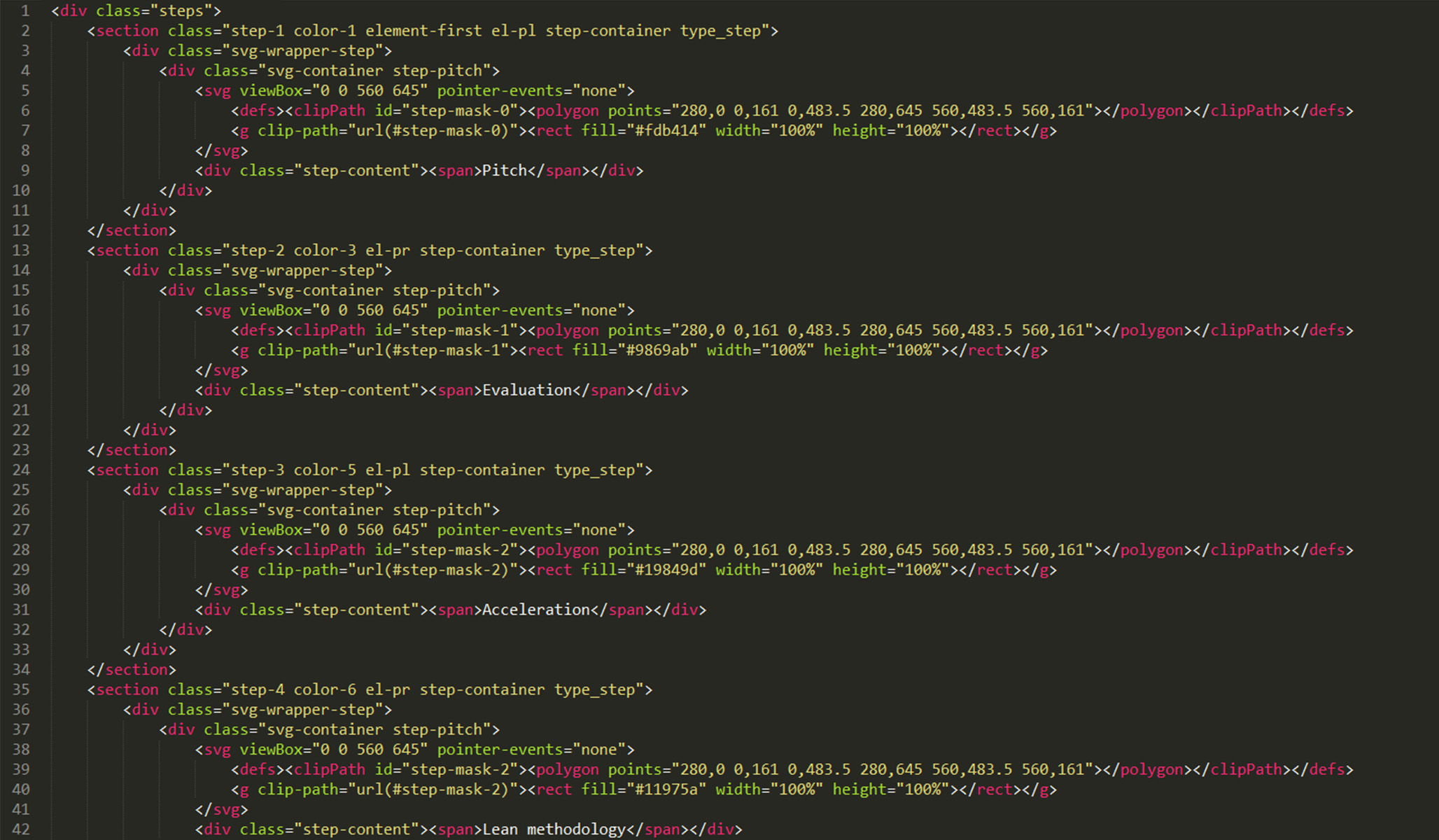
Industrio’s corporate image, based on the shape of a hexagon, is reinforced by various elements of the website (the cut of the images, icons, logo, elements appearing on the page etc.): to obtain this constant presence featuring hexagonal forms, we chose to apply a smart technology capable of ensuring the graphic result and not weighing the pages down. For this reason, the shapes that you see on the pages of Industrio.co have all been devised in SVG. We adapt the smart properties of technical solutions and those of the client to the industrial market.
The emotion-led presentation video of Industrio is the cover page of the website. It starts in autoplay and features no sound track so as not to create problems of use for visitors.
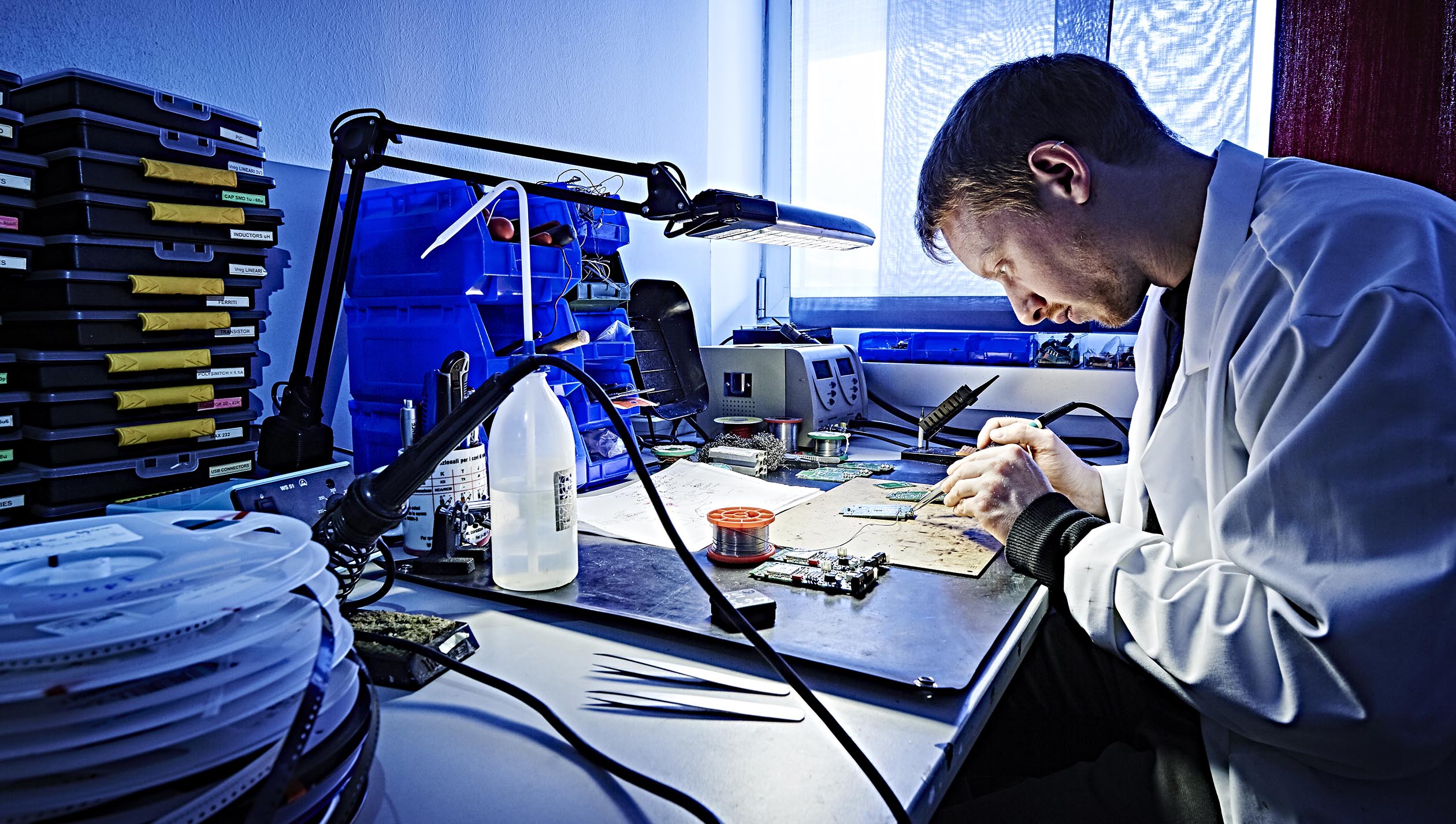
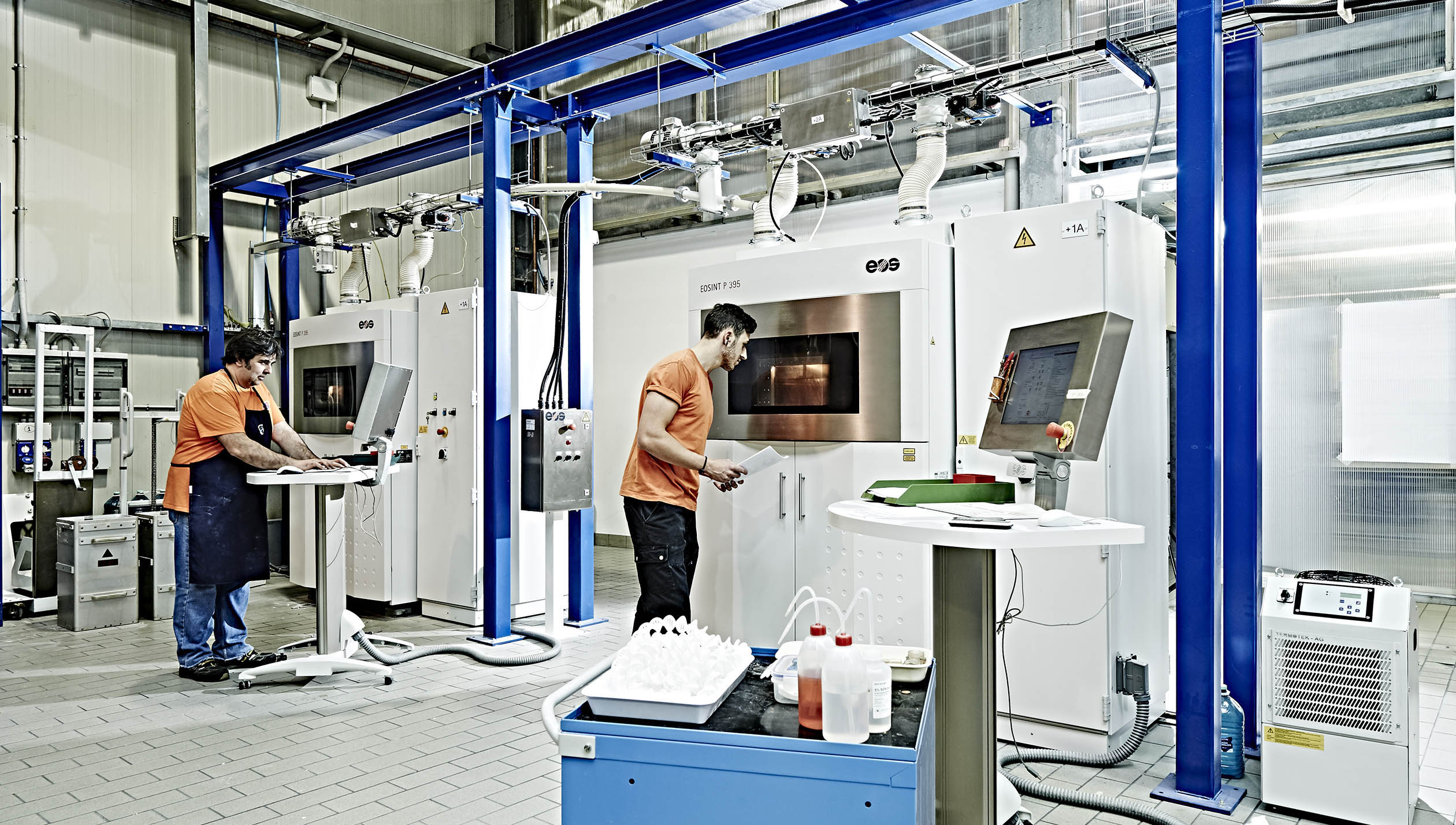
The video was made by the video maker Alberto Batocchi and the photographs are by Daniele Montigiani.
The icons system
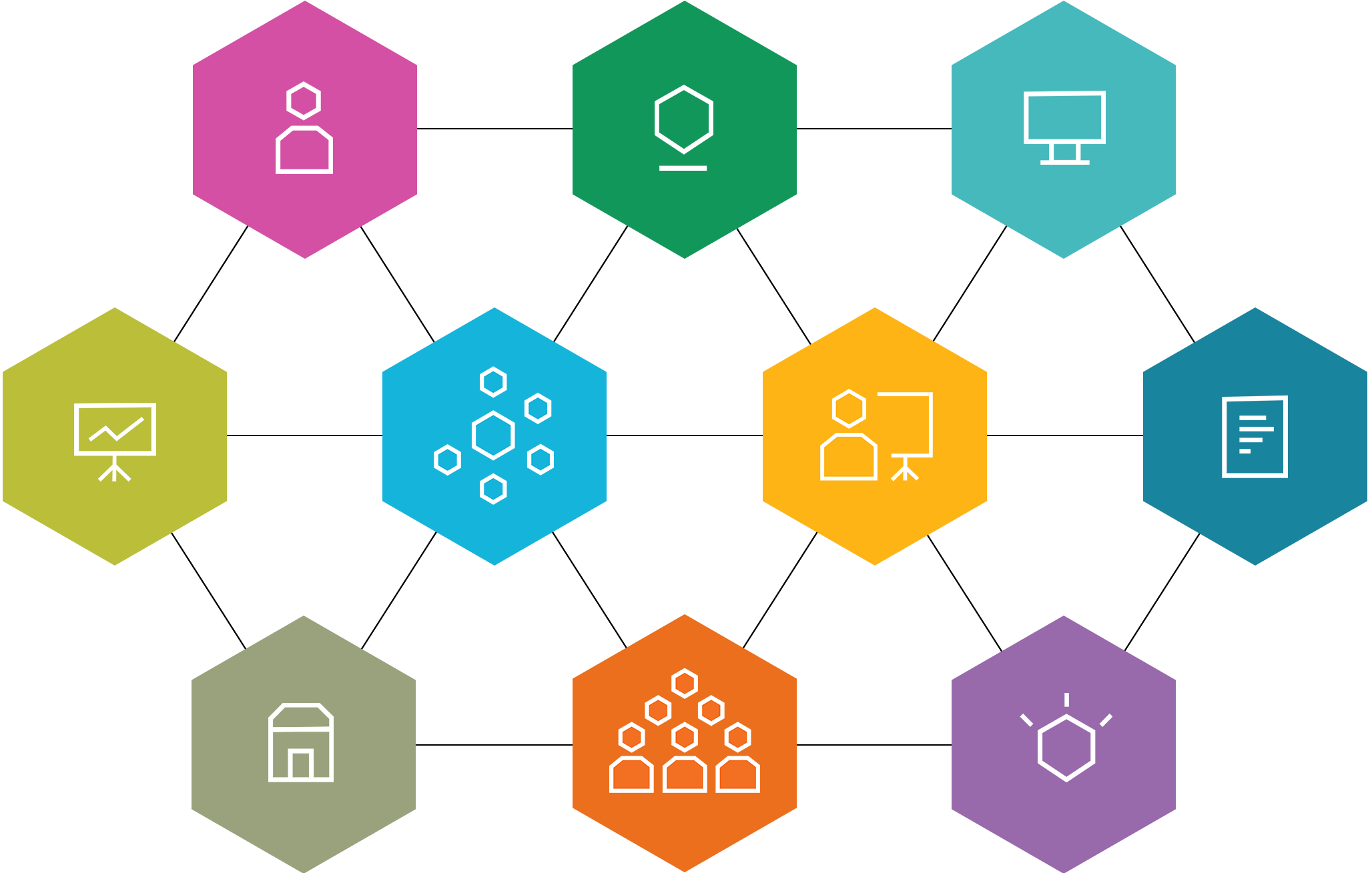
We created a set of specially-made icons in order to describe the eco-system of the services that Industrio offers to start-up companies: the use of colour and hexagonal shapes creates a sense of coordination in all of the graphic elements relating to services.
Extreme responsive design
Just as Industrio manages to ensure structure, clarity and organisation in achieving the ultimate goal of launching a new product, we felt that its website had to be similarly maximised to adapt to the different contexts of use, maintaining characteristics of design and unique identity.
Smart solutions
In order to achieve this constant presence of hexagonal forms, we chose to apply smart technology, capable of ensuring the graphic result and not weighing the pages down too much. For this reason, the shapes that you see on the pages of industrio.co have all been created in SVG. They look like images, but, in fact, they are codes. We adapt the smart characteristics of technical solutions to those of the client’s operation on the industrial market.
A simple and smart form
The main call to action of Industrio’s website is getting firms potentially interested in being accompanied by our client to send off the pitch form. We thought of a form that is very simple to complete and smart down to the very last detail.
